Top Tips – Getting the colour right.
We love it when the print files are perfect, the importance of using the right ICC profile is important in this blog we’ll show how using our custom profiles will help you get stunning results!
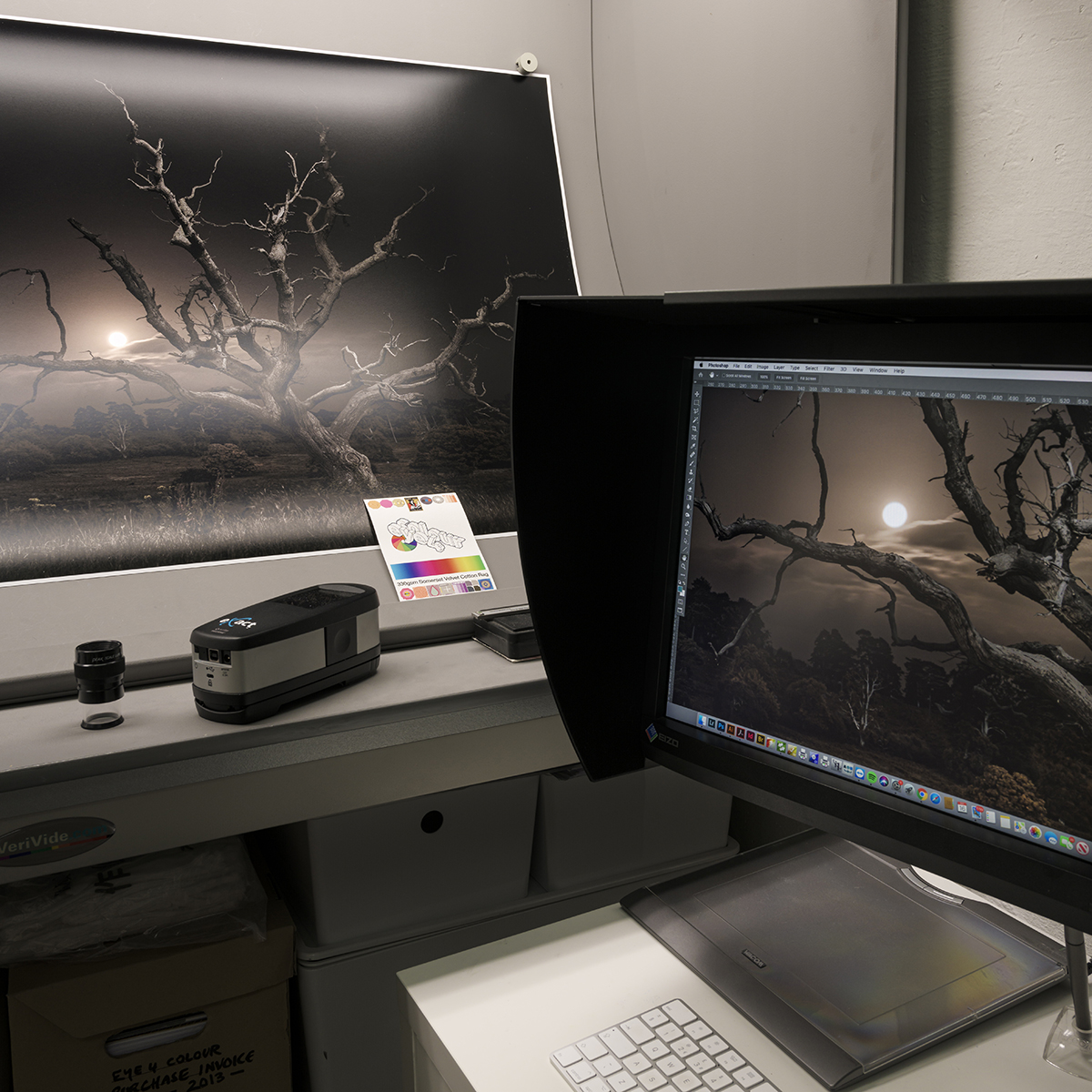
When we start working with customers the first discussion is to be clear on costs, but swiftly it moves on to understanding how the artwork will be supplied. This can involve our photographic capture service using a Phase One medium format camera in daylight balanced lighting for paintings, but many clients supply their own files. These can be from many sources, perfect PDF’s or TIF files to less ideal iPhone JPG’s. We’re not here to judge, we just want to maximise the quality that can be achieved and with 35 years in print we have useful experience that you can tap into.
One critical aspect in the process of file preparation is knowing which colour profile to use, if you’re lost already you may prefer to have a chat with us before falling down a rabbit hole. If not then stick with us as things become clear.
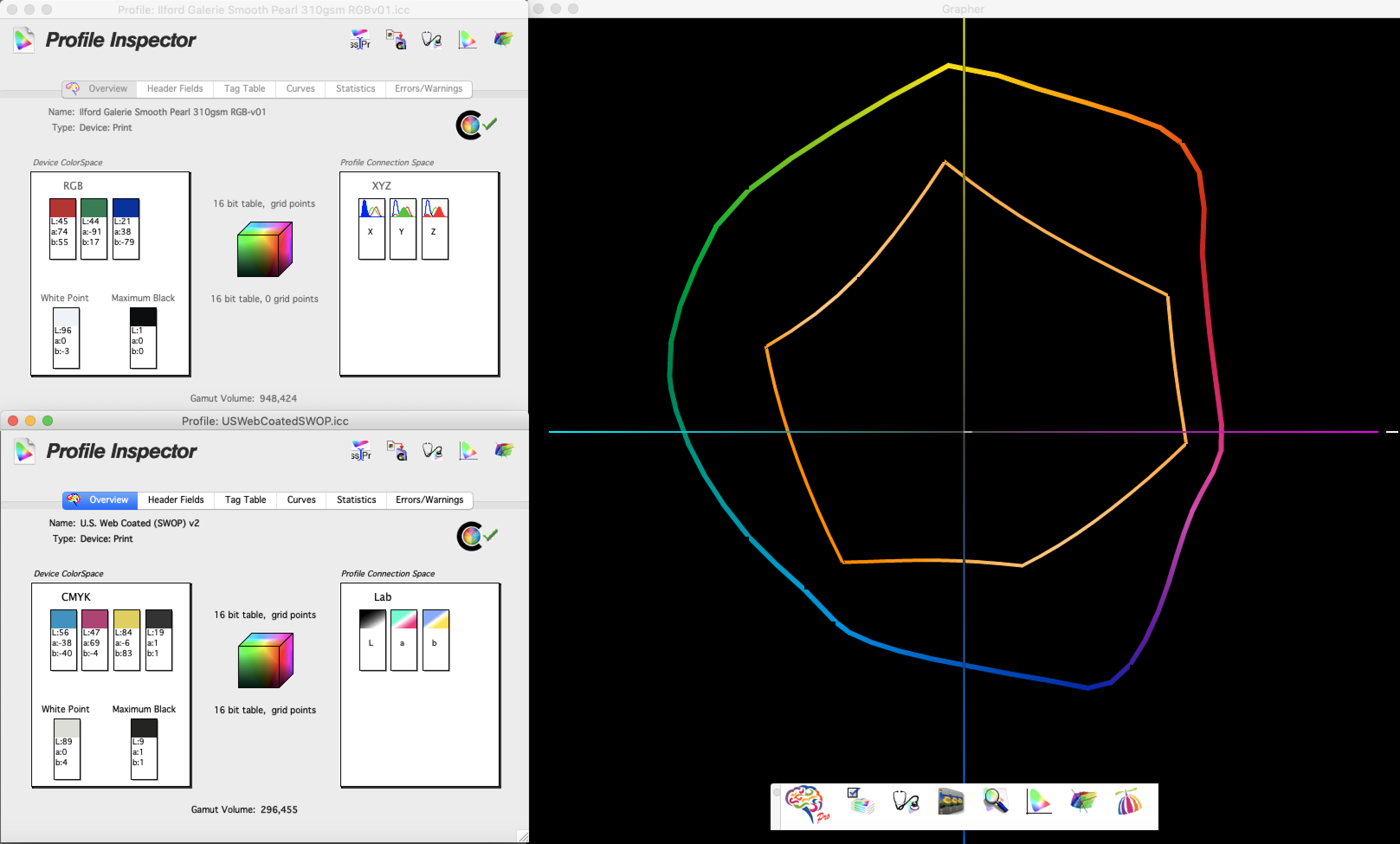
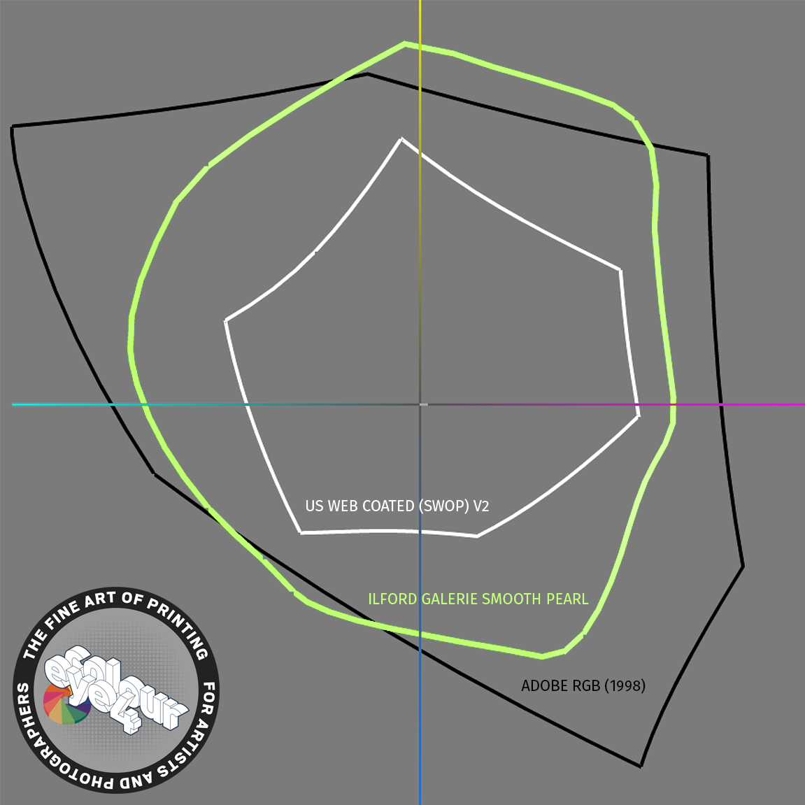
If you’re using Adobe Creative Cloud then you may have the default colour settings which can include the U.S. WEB COATED (SWOP) V2 ICC colour profile for CMYK print which has a small ‘gamut’ or to express it another way, a limited colour range. Whereas if you’re looking to print amazing photographic prints then you’d benefit by using our ILFORD GALERIE SMOOTH PEARL ICC profile which provides a huge gamut in comparison as it utilises the 12 inks in our printer. This is clearly indicated in the 2D Gamut map.
Once a file has been saved with an unsuitable output profile the damage is done, we cannot get the original colour back. As many of you will know output profiles are used within a colour managed workflow to show how a job will look before ink ever hits the paper. We have custom profiled our workflow to ensure it’s accuracy and we are confident in our ability to get it right time after time.
If you hit play on the video clip you’ll see more detail as the 2D becomes 3D revealing a host of colours in the Ilford Galerie Smooth Pearl ICC profile when compared to the Adobe RGB (1998) colour space that can be displayed on high quality monitors.
At Eye 4 Colour we use Eizo Coloredge screens that are fully calibrated so that we can make colour assessments for critical applications with confidence. Whilst this may represent overkill for some jobs, they also benefit from our workflow being reliable and consistent which makes the whole customer experience easy.
This approach represents a key difference for our more demanding clients, we welcome a challenge and whilst we can’t guarantee that we’ll hit every colour shade every time we are certain that you not going to find a better result elsewhere. But be aware fluorescent or metallic inks can only be offered as spot colours by screen printing on top.
We use a variety of tools to assess colour profiling and can easily map an image and it’s colours against the chosen ICC profile to show any colours that are unprintable.
In this diagram you can see that The Ilford paper has a printable colour range of just under 950,000 colours with a black that is as good as perfect. Our print technology also prints a final grey across the printed image leading to a smooth surface finish looking like C-Type.
If you look at the colour range of U.S. Web Coated (SWOP) v2 you’ll noticed a maximum colour range just over 295,000 colours which is a massive loss and results in flat results that don’t in any way reflect our ability.
We appreciate that this can be a little confusing but we’re here to answer your questions and guide you.